For years, I spent so much time creating math anchor charts. I wrote them carefully, color-coded everything, hung them around the room, and genuinely believed students would constantly reference them independently.
But over time, I realized something frustrating:
many students weren’t actually using the charts.
The charts were technically on the wall, but students often stopped noticing them after a while. Some became overwhelmed by too many visuals, while others struggled to locate the information they needed quickly enough to use it independently during math tasks.
That realization completely changed how I approached math anchor charts in my classroom.
The Problem With Traditional Math Anchor Charts
Don’t get me wrong — I still believe anchor charts are incredibly valuable.
Visual references:
- support student independence,
- reinforce vocabulary,
- strengthen conceptual understanding,
- and help students organize their thinking.
But I also think there are a few common problems teachers run into with math anchor charts:
Too Many Charts
By the middle of the year, classroom walls can become overloaded with visuals.
Inconsistent Organization
If every chart looks different, students sometimes struggle to quickly locate and process information.
Charts Become “Wallpaper”
Students stop actively using them because they blend into the background of the classroom.
Handwritten Charts Take SO Much Time
I love a good handwritten anchor chart, but realistically, keeping up with them during a busy school year can feel impossible.
And honestly?
Some of my handwritten charts looked a little rough by the end of the week anyway.
My Math Anchor Chart Hack
Eventually, I started simplifying my system.
Instead of constantly creating brand-new anchor charts from scratch, I began using printable math anchor charts with consistent formatting and organization throughout the year.
That consistency made a huge difference.
Students knew:
- where to look,
- how the charts were organized,
- and what kind of information each chart would include.
The charts became tools students actually used instead of decorations hanging on the wall.
One of my favorite parts of this system is that students can also keep personal copies for reference during independent work, math centers, small groups, or homework. That additional accessibility helps students become more independent problem-solvers because they do not have to rely entirely on teacher assistance.
Why This Works Especially Well in Upper Elementary
As students move into upper elementary math, the content becomes significantly more complex. Having clear visual references available can reduce frustration and help students feel more confident tackling challenging tasks.
I’ve also noticed that consistent visual supports are especially helpful for:
- struggling learners,
- students with attention difficulties,
- visual learners,
- and students who need additional reinforcement of vocabulary and concepts.
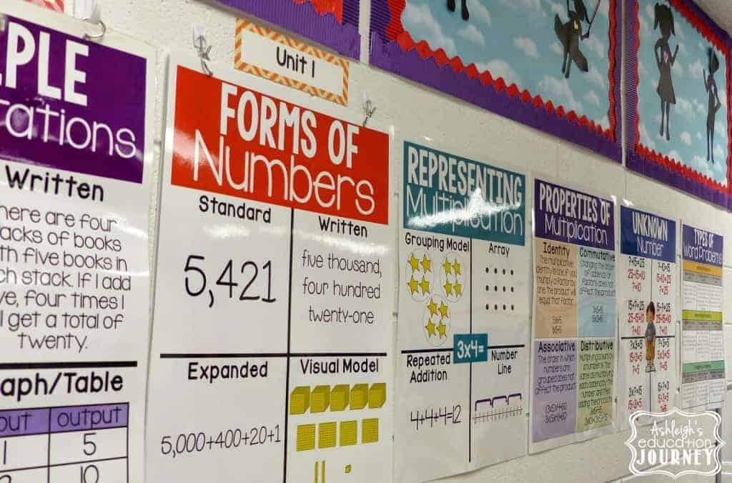
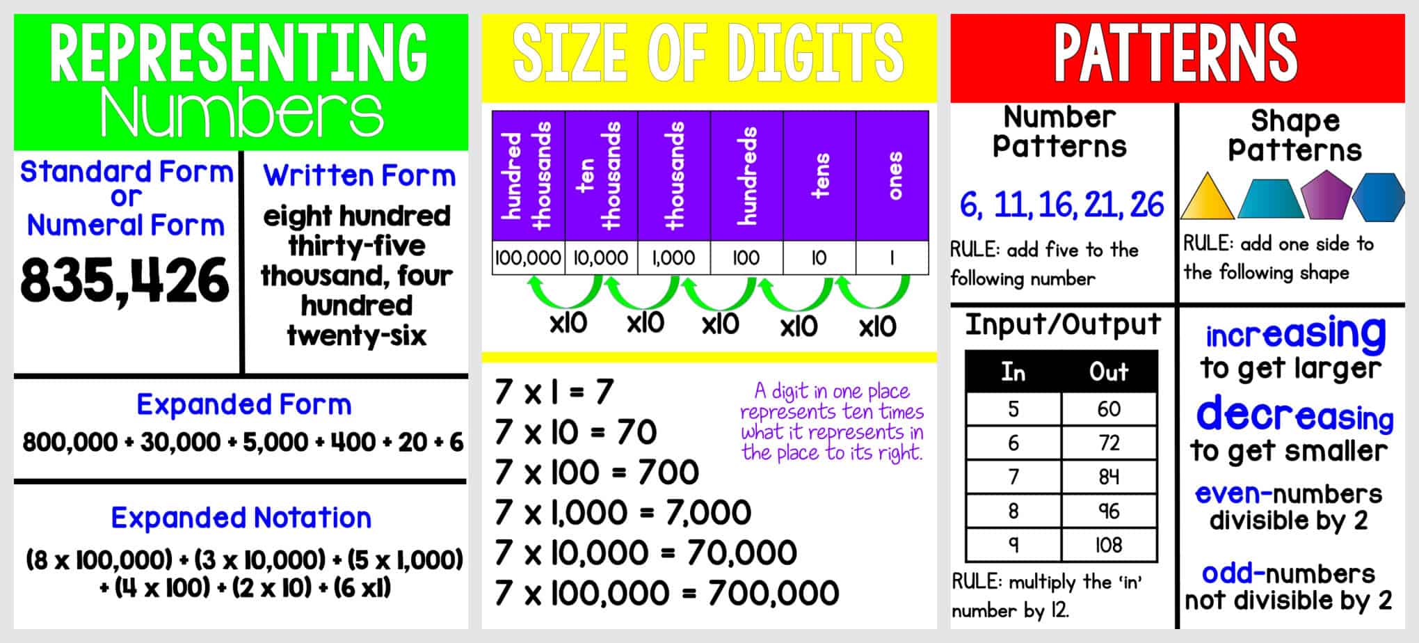
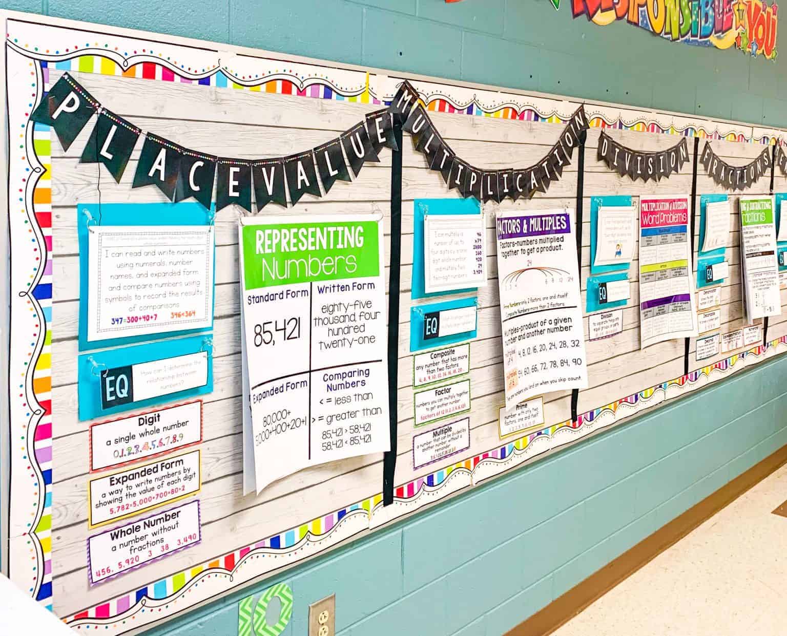
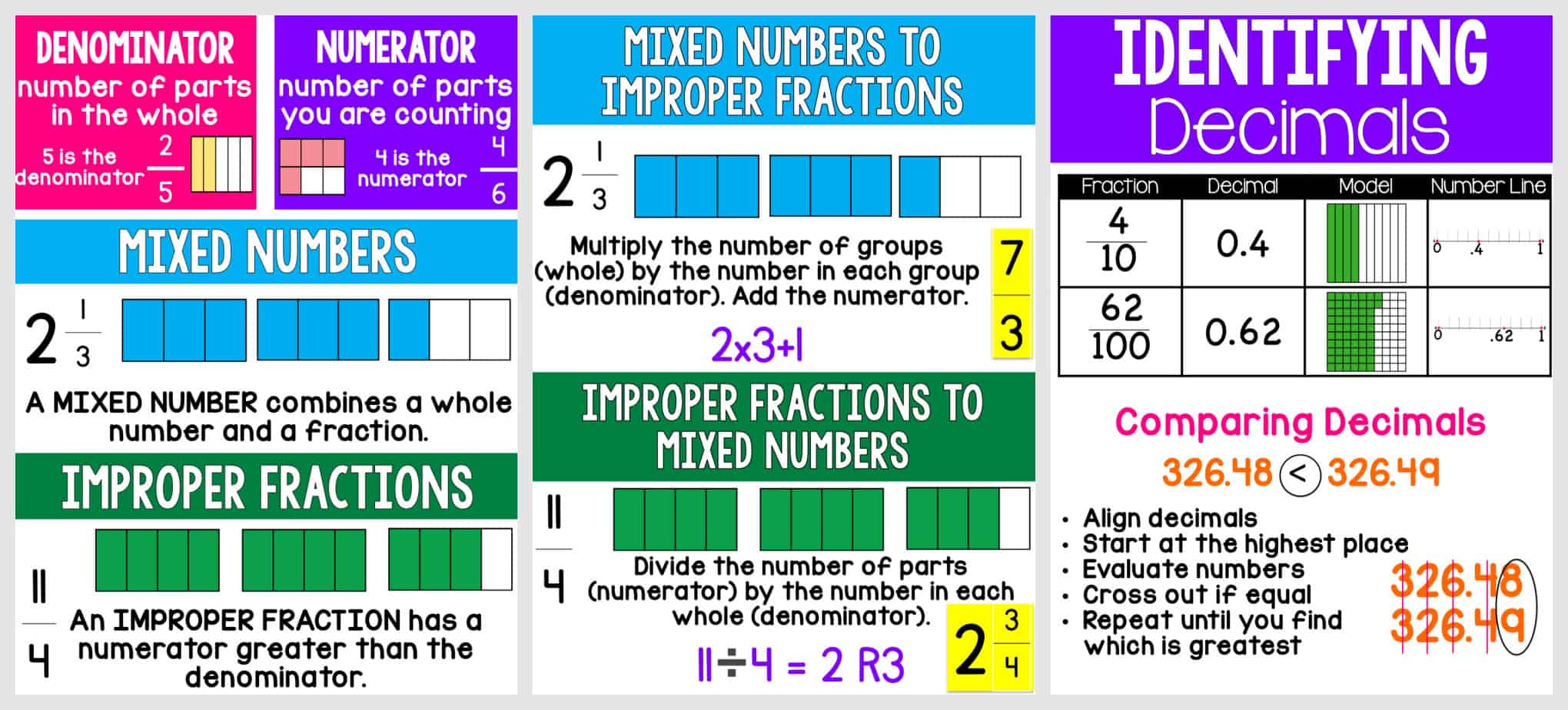
Printable Math Anchor Charts
Because these charts worked so well in my own classroom, I eventually created printable versions for all upper elementary math standards.
These printable math anchor charts:
- use consistent layouts,
- support student independence,
- reinforce important vocabulary and strategies,
- and save me an incredible amount of time during the school year.
They’ve honestly become one of the most useful tools in my classroom.
✅ 1. Covers Every Standard—Without the Stress
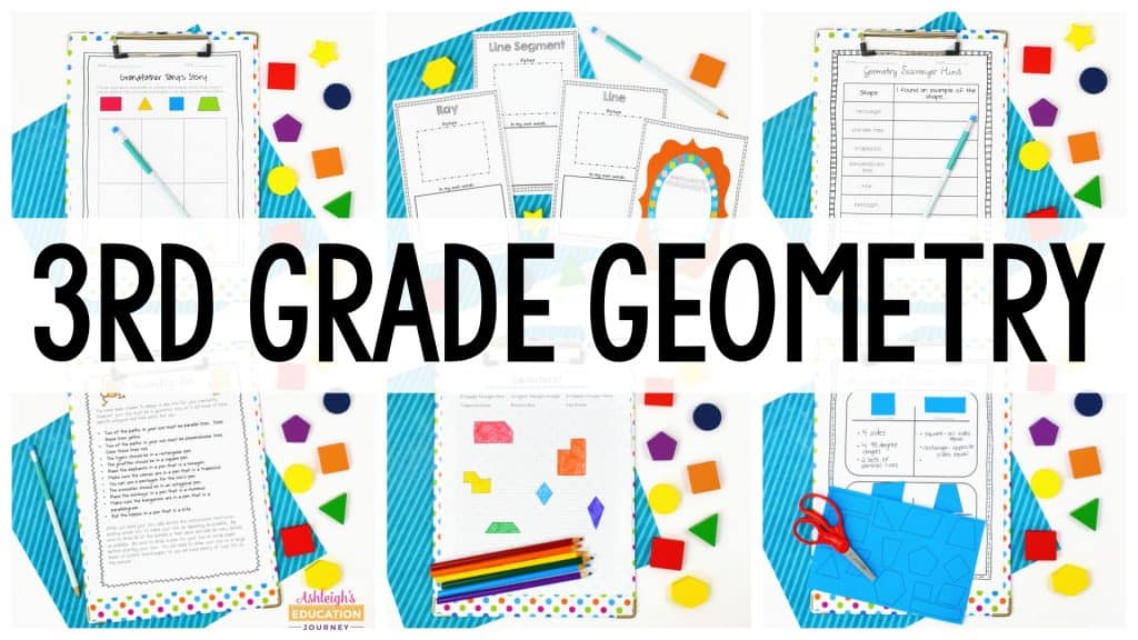
No more wondering if you’ve covered it all. These charts are aligned to every 3rd grade and 4th grade math standard. From operations and algebraic thinking to geometry, fractions, measurement, and base ten, every major topic is clearly laid out with age-appropriate language and visuals.
![]()
✅ 2. Print-and-Go Convenience
Forget about the markers and chart paper. These charts are designed to be ready when you are.
You get two size options for every standard:
-
Large Posters (18×24) – Great for whole-class lessons. Print on 6 standard pages and tape them together or send them to a low-cost poster printer.
-
Small Posters (8.5×11) – Perfect for math folders, stations, or one-on-one support.
✅ 3. Supports Visual Learners & Struggling Students
Let’s face it—math can be abstract. That’s where visuals become your best friend.
These anchor charts are clean, consistent, and easy to read. Students with reading challenges, visual processing issues, or attention difficulties benefit from seeing clear text, bold headers, and structured layouts they can return to over and over again.
![]()
✅ 4. Creates a Cohesive, Polished Math Environment
There’s something powerful about a classroom that looks put together. These anchor charts give your room that unified, intentional look—which not only helps you stay organized but also signals to students that math matters.
It’s a small change that makes a big impact.
Ready to Simplify Your Math Instruction?
These math anchor charts are the kind of resource you’ll use every day. And best of all? Once you print them, you’re set for years to come.
Click on what you need to grab your set now and give your students the consistent support they need to succeed in math.
I had a lot of request for other subjects, so here’s more of what you may need!
Let’s make math visual, accessible, and a whole lot easier—for everyone.
Love your charts Ashleigh. I just popped the 4th grade charts right into my TPT cart. I am about to finish my 29th year of teaching on June 19th. Next year…. 4th grade! I haven’t taught 4th before, so I will likely be checking your blog frequently. I’ve used many of your third grade resources and they are always fabulous. Thanks for all you do! I hope you’re enjoying your summer.